Want to create a great landing page to showcase your product? Then you must first check out a few of the best landing page examples. By going through the examples, you can get enough ideas for creating a killer landing page for your business.
A landing page is an essential element for any online business as it drives targeted traffic. But designing a perfect landing page is tricky in the SaaS business. Even a small mistake can ruin your efforts.
No worries, to help you decide which approach to take, we have researched some best SaaS landing page examples for you. But before jumping straight to the examples, let’s first understand a few things about the Saas Landing Page.
What is SaaS Landing Page?
A SaaS (Software as a Service) landing page is a web page that is designed to promote and market a SaaS product to website visitors. It highlights features, benefits and pricing plans of the product or services. Along with this customer reviews or case studies are placed as social proof. The ultimate goal of the SaaS landing page persuades visitors to sign up for a free trial or purchase a subscription to the service.
A well-designed landing page includes demo videos and a call-to-action (CTA) that helps to convert potential buyers to customers. Additionally, the landing page may be optimized for search engine visibility. This includes targeted keywords and phrases that potential customers are likely to look for.
Also, the page could be made using responsive web design techniques, ensuring that it can be easily viewed and navigated on a range of devices, including desktop computers, tablets, and smartphones.
But what should be included on a SaaS landing page?
Key Element That Makes A Great SaaS Landing Page:
To make it successful here are several key elements to be included on a landing page.
Headline –
The headline is the section on the landing page that will be visible as soon as users reach your website. So, it should be attention-grabbing and short that tells everything about the product or service.
Description –
A great landing page keeps its description very informative and benefit-oriented. Which include features, benefits, pricing plans, etc. It is necessary to tell visitors in short what they want to know.
Media –
Make sure you add images and videos to illustrate your software’s key selling points. Sometimes images speak louder than text which helps you tell your brand story. Whereas videos can be used to explain complex information quickly.
Unique Selling Point (USP) –
You should highlight your product or service USP to stand out.
Contact Forms –
Having a contact form is essential if you want to collect email addresses. Make sure you keep your field minimal as you can collect more information later in the customer journey.
Social Proof –
You can display your customer testimonials, notable customers, star ratings or case
CTA Buttons –
Call-to-action (CTA) buttons should be used strategically and must be eye-catching. You can even use the FOMO element like a countdown timer to get people to click on the CTA button. This will increase your conversion rate and boost other growth metrics. The best way to place the CTA button is above and below your landing page fold. This allows you to target people at various stages of the decision-making procedure.
All the above are the necessary elements, but there are some best practices for SaaS landing pages, such as encouraging free trials and avoiding too much tech jargon, which should be considered in addition to the basics.
Top 10 Best SaaS Landing Page Examples
In order to maximize your next landing page design, you need to know more than just the seven essential features of a SaaS landing page. Instead of having a close look at SaaS landing page examples of market leaders can help inspire you. Here are some examples that provide an excellent overview of effective landing page designs.
Sendinblue (Best Landing Page Examples)
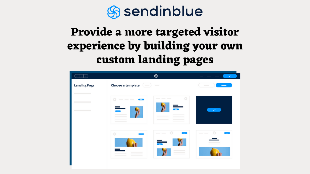
Sendinblue has done a great job keeping its landing page simple and minimal. It has displayed an animated video which gives a clear message of a growing business. A short headline with 2 lines of supporting text is enough to describe a product or service. And followed by CTA which asks users to take a free test drive of software. A simple white background looks decent and highlights other elements clearly.
Other Highlights:
- Short and effective copy
- Testimonials from prominent customers
- Humanizing images
- Great user experience.
- Benefit-oriented reason for upgradation.
FreshBooks:
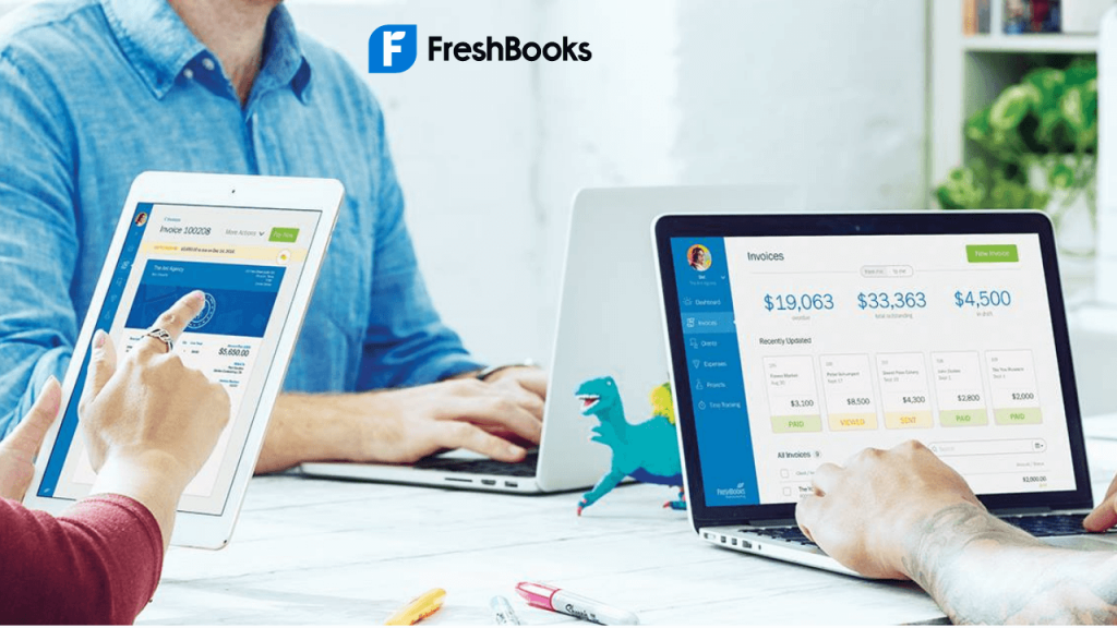
FreshBooks target users with an attractive headline and CTA to try it for FREE. You can even see 2 different CTA below that for two different signups. Discount showing the large price reduction (50% off) on the top of a landing page is more eye-catching. Also, you find a 4.5-star rating which is placed just above the headline, which reflects customer satisfaction. Humanized images are used to make it more appealing. The landing page is a little lengthy but informative which can clear visitor’s doubts.
Other Highlights:
- The headline describes the page’s intent
- Logos from well-known brands
- Rating described with social proof
- Displaced features and offering
Asana:
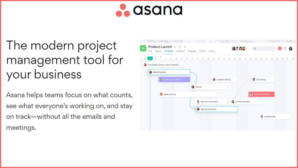
This is one of the most powerful SaaS landing page examples. Asana a project management software comes with a landing page that starts with super compelling headlines and infographics images. The combination of these two-element on top creates a convincing explanation of their software works. You can find neat, clean and up-to-the-mark explanations of its product features and benefits. The interactive slider of 200+ integration of tools it eye-catching.
Other Highlights:
- Benefit driven headline
- Products Screenshots
- Further readings
- Clear CTA
Sprout Social:
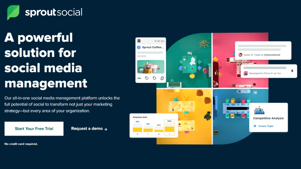
SproutSocial landing pages are quite like the above example. The first thing that you will notice is the black background with white text and the multi-colour thumbnail to the side. This makes the headline catchy and draws the attention of the users. Lower down you will find social proof of awards which they have received. No doubt it has managed to create a simple UX happy path across the full landing page.
Other Highlights:
- Powerful headline and copy
- Simple and effective design
- Clearly separated sections
- High contrast CTA
Zapier:
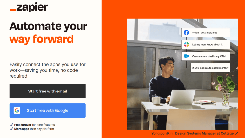
Zapier’s design is definitely a bit denser than some of the other examples on this list, it keeps its CTAs consistent throughout the full landing page. The main CTA is, of course, emphasized in black and blue to stand out to prospects. You can even find multiple support resources on the landing page that helps users to find answers to their questions. Perfectly use of the colour combination to hight text and make it more readable.
Other Highlights:
- Testimonial image slider
- Multi-brand logos
- Infographic videos with great animation
- Products rating
- Feature explanation
Canva
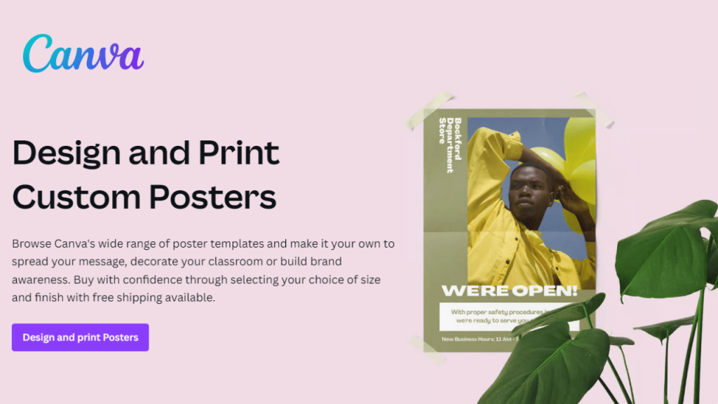
Canva has different landing pages for its products such as logos, posters, businesses, flyers, invitations, brochures, etc. It has adopted a suitable SaaS landing page design depending on which product, tools, or features is being highlighted. Canva Poster Maker landing page uses a lilac shade in the background to highlight the heading and image. The CTA button with a dark blue shade asks users to start creating posters. Also, you can find the landing page more informative and carries multiple examples to convince users. For covering a single tool, this can be the best landing page example that hits the nail right on the head.
Other Highlights:
- Detailed tool description
- Interactive interface
- Posters examples for inspiration
- Step-by-step guide
- Straightforward CTA button
Monday.com
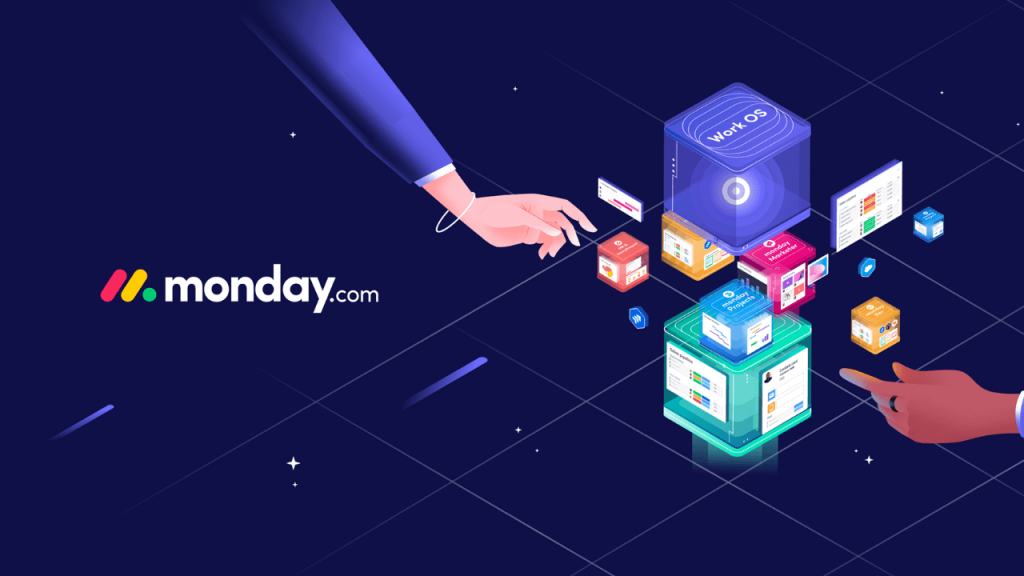
Monday at the start of the landing page ask users to choose which tools they want to use. This lets them customize the customer experience right from the start and show off the most useful features for each user. It has also used statistical examples of how efficient and effective the software is. This helps to attract users as it works as key consideration while choosing the software. It has also mentioned its customer testimonials, awards, and community as social proof.
Other Highlights:
- Actionable Headline
- Product Screenshot
- Easy to navigate
- One focus CTA
- Personalization
Dropbox
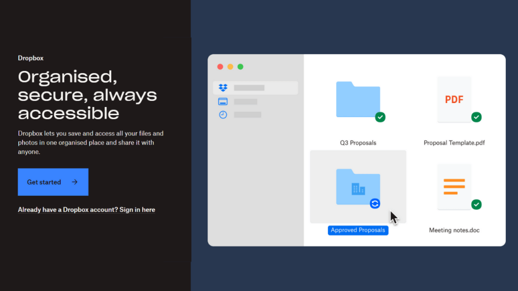
Dropbox is one the best landing page example of how a simple design can minimize friction for users. It’s a short simple headline and an eye-catching animation to hook people in. The copy has enough space and a good colour combination that make a perfect landing page. For those who are looking for finer details, Dropbox dropdown them to the FAQs. Overall, the landing page is perfectly designed to attract, and convince users
Other Highlights:
- Benefit Driven Headline
- Bold And Large CTA
- Animated Images
- Stories slider
- Features and benefits section
Moz
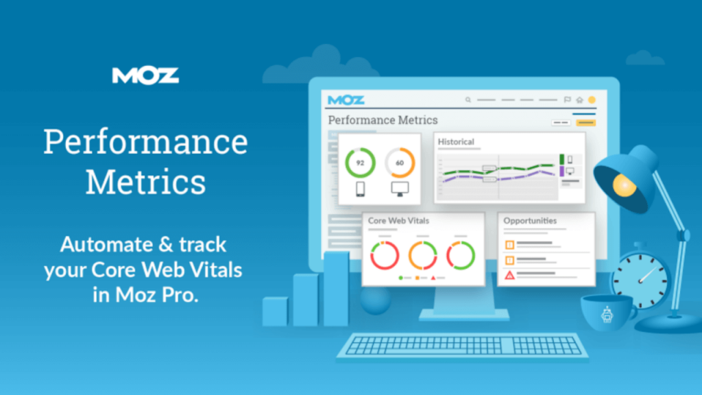
Moz has displayed headlines with one-line product descriptions and CTA in a centre alignment. This helps to hook prospects in and get them to scroll below. Product features and offerings are shown in a clear comparison table. Scrolling down the page provides more information about its service. Also, you can find stats that give a clear idea about a product and its services.
Other Highlights:
- Informative images
- Product screenshots
- Well description
- Simple and easy-to-navigate interface
- Decent colour combination
Figma
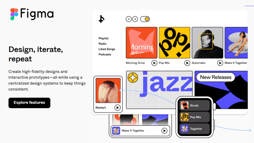
As a designer, you would agree that Figma has one of the best landing pages. It has bold and large headlines with animated effects is more attractive. It seems that Figma has done deep research before creating such an amazing landing page. All the product screenshots, text, CTA, and other sections are perfectly suitable for the target audience. You can find a short and simple copy of the product description. No doubt the design of the landing page suits enterprise SaaS marketing.
Other Highlights:
- Informative resources and reports
- Focus on industry
- White Space
- Personalized for user needs
- Clear demonstrated benefits
Final Thought – Best Landing Page Examples
In today’s highly competitive digital landscape, creating an effective landing page is crucial to the success of any online business or marketing campaign. By focusing on key elements such as clear and compelling headlines, persuasive copy, strong calls-to-action, and user-friendly design. The best landing pages are able to capture the attention of visitors and convert them into valuable leads or customers.
By studying and learning from some of the top landing page examples out there, you can gain valuable insights and inspiration to help you create landing pages that deliver real results for your business. Remember, always test and optimize your landing pages to continually improve their performance and maximize your ROI.